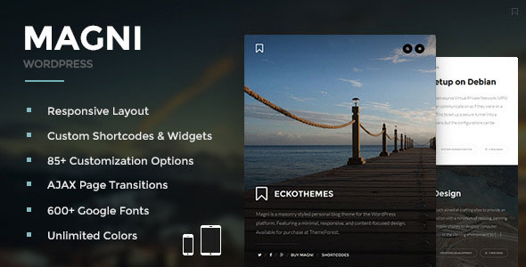
**Immersive Experience for All Devices** Enjoy seamless interactions across a range of devices, from smartphones and tablets to large desktop monitors. Our platform is expertly designed to: 1. **Adapt to Any Screen Size**: Our responsive layout automatically adjusts to the screen dimensions, ensuring a clean and intuitive interface on every device. 2. **Sharp Visuals**: With retina-ready high-resolution graphics, you'll enjoy crisp, clear images and visuals that bring your content to life.
3. **Fast and Smooth Page Transitions**: Our AJAX-powered transitions ensure a lightning-fast and enjoyable browsing experience, even on slower connections. 4. **Streamlined Navigation**: Our slide-down drawer menu provides quick access to widgets, sidebars, and essential...
Please purchase licenses and support directly from the original publisher whenever applicable. SaveTheme does not provide official author support.
Comments
No comments yet. Start the discussion below.