- Internet Explorer 9 and above
- Firefox
- Google Chrome
- Opera
- Safari
- Android
- Blackberry
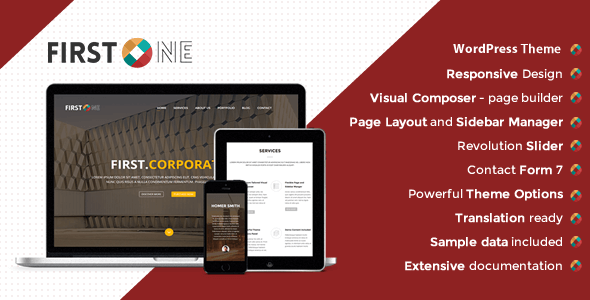
FirstOne's adaptive layout features a robust 12-column grid system with a generous 1170px width, ensuring an immersive and engaging browsing experience on desktops, tablets, and mobile devices alike. Its W3C valid source code is meticulously formatted and commented for ease of use, making it a developer's dream to work with. With FirstOne, you can create stunning, one-page websites that load quickly and look fantastic on any device.
Important:
Please purchase licenses and support directly from the original publisher whenever applicable. SaveTheme does not provide official author support.
Related
Comments
No comments yet. Start the discussion below.